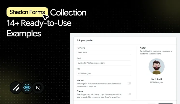
Forms are everywhere in modern web applications. From user authentication and profile management to checkout flows, onboarding, and account settings, they are the primary way users interact with your product.
Creating a great form takes more than adding a few input fields. You need reliable validation, keyboard accessibility, clear error messages, responsive layouts, and a structure that remains easy to maintain as your application grows.
That's where Shadcn UI stands out. Instead of providing rigid, prebuilt form components, it offers accessible, composable building blocks that work seamlessly with libraries like React Hook Form and TanStack Form. This gives developers complete control over styling and behavior while following modern React development practices.
In this article, you'll find 14 practical Shadcn form templates and examples that you can use as a starting point for your next project. Whether you're building a SaaS platform, admin dashboard, ecommerce application, HR portal, or internal tool, these reusable form patterns can help you build faster without compromising accessibility or user experience.
Choosing the Right Form Library
Shadcn UI focuses on the presentation layer, so you'll typically pair it with a dedicated form library to manage validation, state, and submission logic.
For many React applications, React Hook Form remains the preferred choice because it delivers excellent performance, integrates naturally with Zod, and minimizes unnecessary component re-renders.
TanStack Form is another strong option for applications with complex workflows. It provides granular field state management, flexible validation strategies, and handles deeply nested or conditional forms with ease.
Regardless of which library you choose, both integrate smoothly with Shadcn UI components, allowing you to build accessible, scalable, and maintainable forms without reinventing common patterns.
Best Shadcn Form Templates & Examples
The examples below were selected based on practical usability, accessibility support, flexibility, and how well they fit real production applications.
Multipurpose Input Form
Best for: Registration forms, contact forms, account creation, and customer information collection.
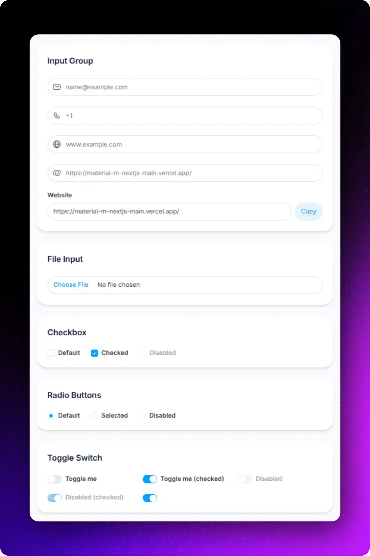
Multipurpose Input Form
This is more than a basic input form. Along with standard fields like email and phone number, it includes commonly used form components such as file upload, checkbox, radio buttons, and toggle switches, making it a complete starting point for many dashboard workflows.
Accessibility highlights:
Each input connects to its own FormLabel and FormControl for screen readers.
Validation errors are rendered through FormMessage and are announced appropriately.
Keyboard tab order follows the visual field sequence.
Interactive components such as checkboxes, radio buttons, and switches are fully keyboard accessible.
File upload fields include proper labeling for improved usability.
Text Area Input Form
Best for: Comments, support tickets, reviews, and feedback collection.
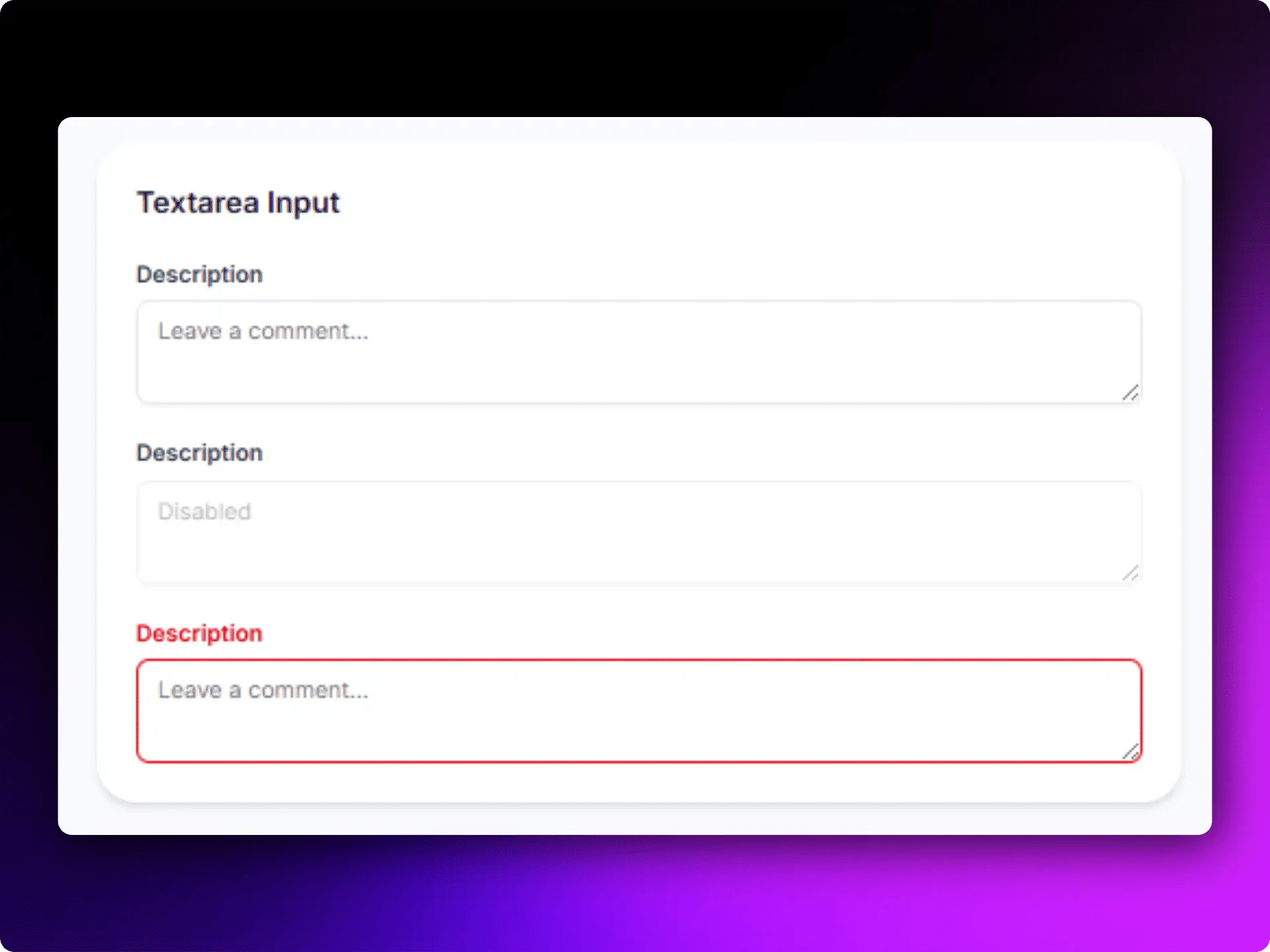
Text Area Input Form
This Shadcn form example uses one text area with clear validation states. This simple form pattern appears frequently in customer support systems, community platforms, and feedback modules.
Accessibility highlights:
Large typing area
Clear placeholder guidance
Screen-reader friendly labels
Responsive form design
Form with Checkbox
All these Checkbox forms help users confirm actions before submission. They are frequently used during registrations, checkout flows, and account setup processes. This Shadcn form component pairs a multi types of checkbox with a submit button and handles both. These forms fit any flow where a user must confirm something before proceeding.
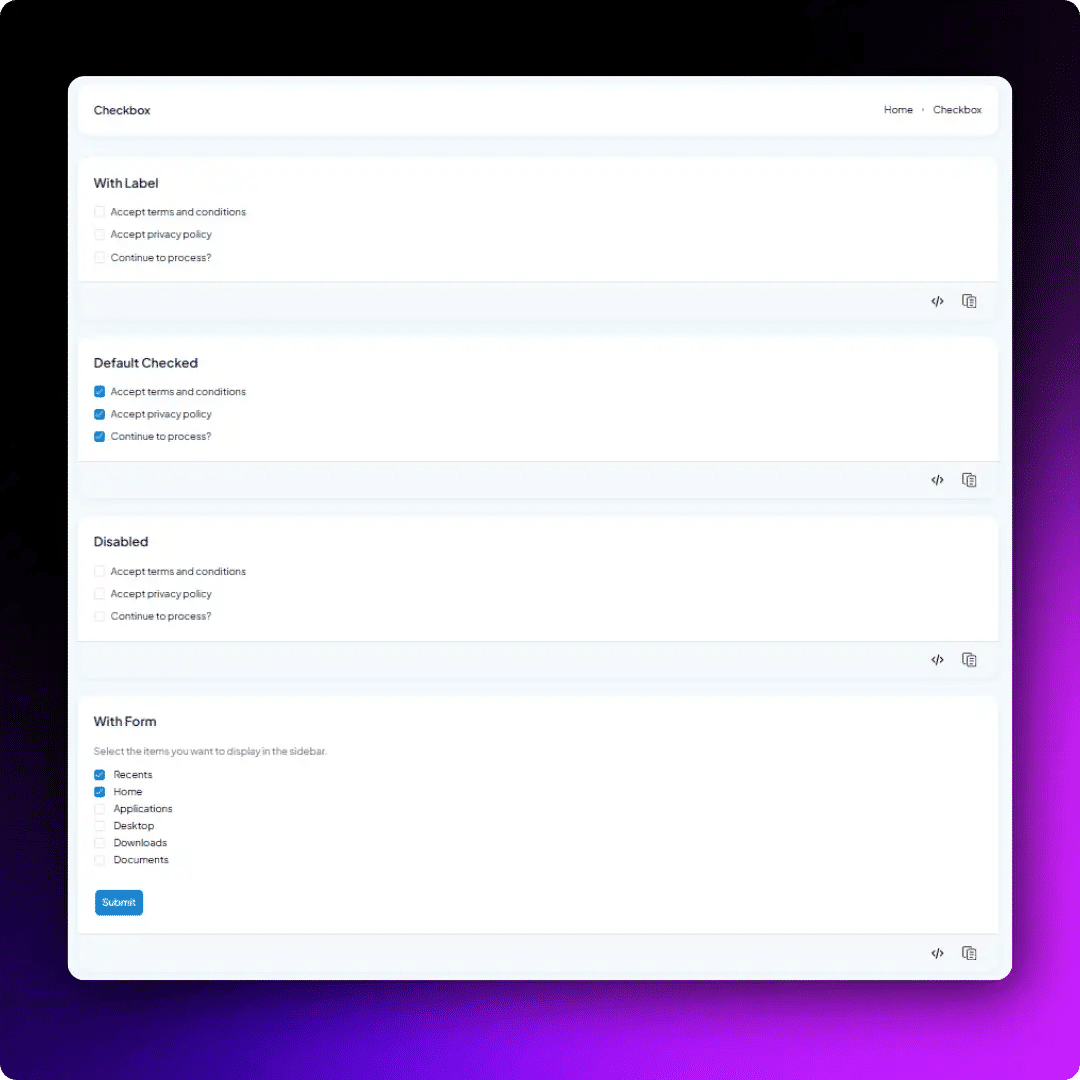
Form with Checkbox
Accessibility highlights:
Proper label association
Large click targets
Keyboard accessible interactions
Clear checked and unchecked states
Best for: Terms acceptance, newsletter subscriptions, permissions, and preference management.
Basic Input Form with Colour Elements
This Shadcn form component combines standard input fields with a color input and textarea. It helps users select and manage color values while keeping the form simple and easy to use.
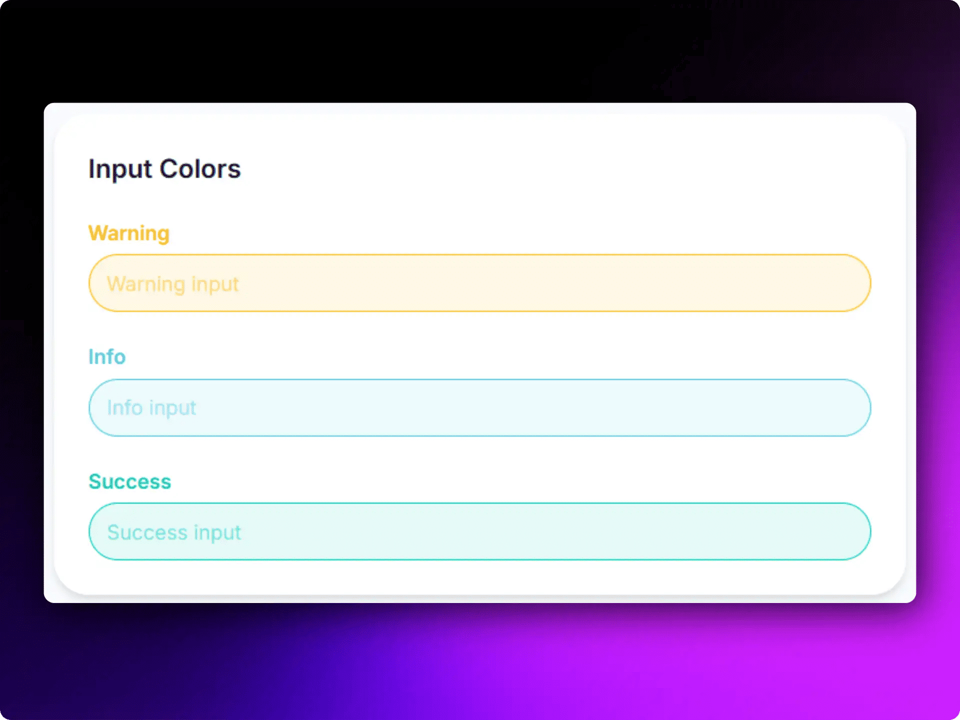
Input Form with Color TextArea
This Shadcn form layout includes a color picker with a visible preview, making it easier to identify the selected color. It works well for applications that allow users to customize branding, themes, or design settings.
Accessibility Highlights:
Visible color preview
Keyboard-accessible controls
Clear color selection feedback
Simple and easy-to-use interface
Best for: Branding settings, theme customization, product configuration, and design tools.
Edit Profile Form
Profile editing may look like a simple form, but it often includes avatar uploads, privacy settings, and account preferences in one place. This Shadcn form template brings all these fields together in a clean layout.
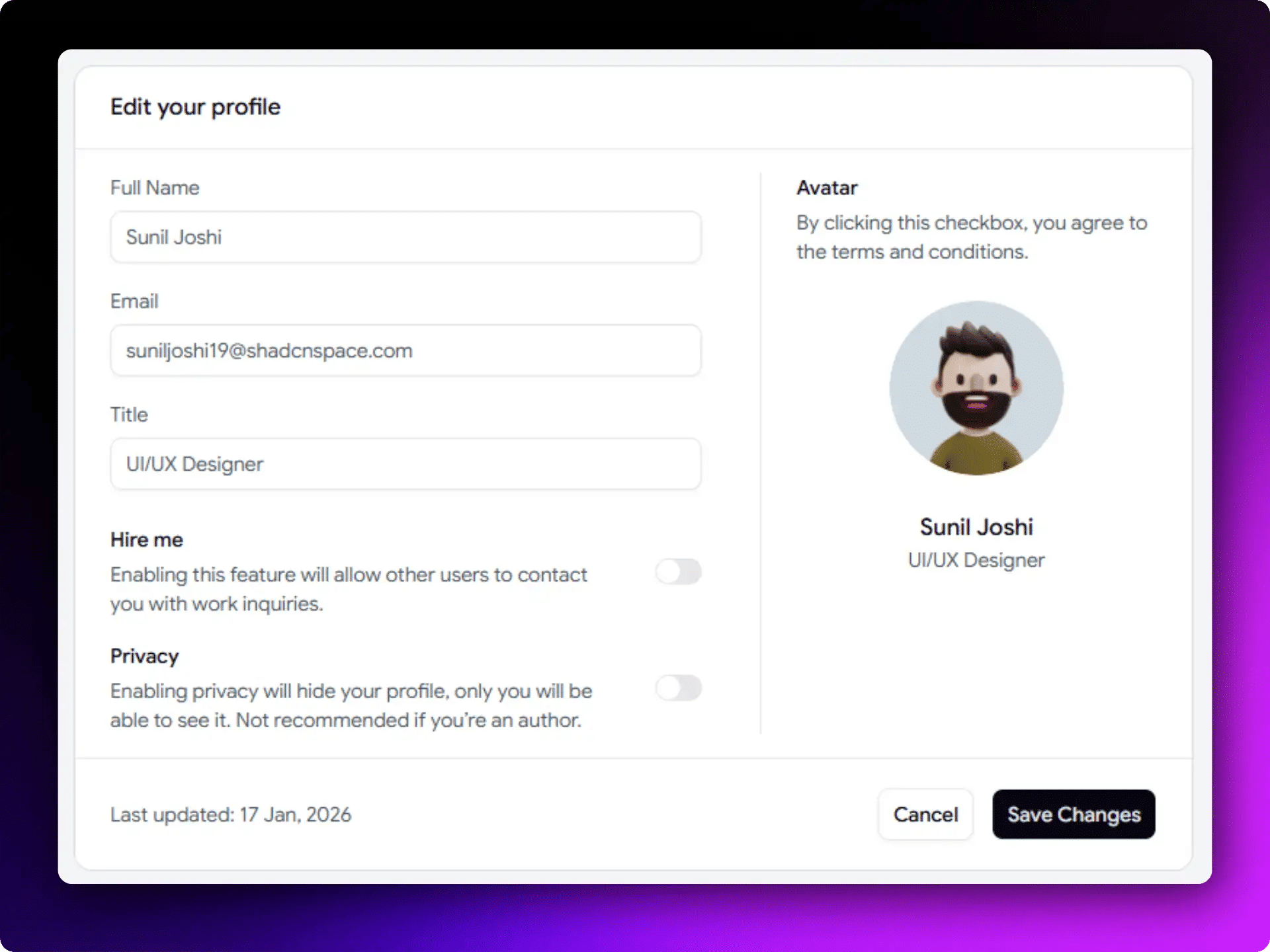
Edit Profile Shadcn Form
It works well for the admin panel where users need to manage their account information without moving between multiple screens.
Accessibility Highlights:
Avatar upload, personal details, and privacy settings in one form
Toggle switches clearly show enabled and disabled states
Save and Cancel buttons are easy to find and use
Logical field grouping for better navigation
Keyboard-friendly interactions
Best for: Account management and user settings in SaaS dashboards.
Live Preview - https://shadcnspace.com/preview/forms-01
User Profile Form
This Shadcn form layout organizes related fields into separate steps, making the form easier to navigate and fill in the details. Managing personal, workspace, and network information in a single form can become difficult when everything is placed on one screen.
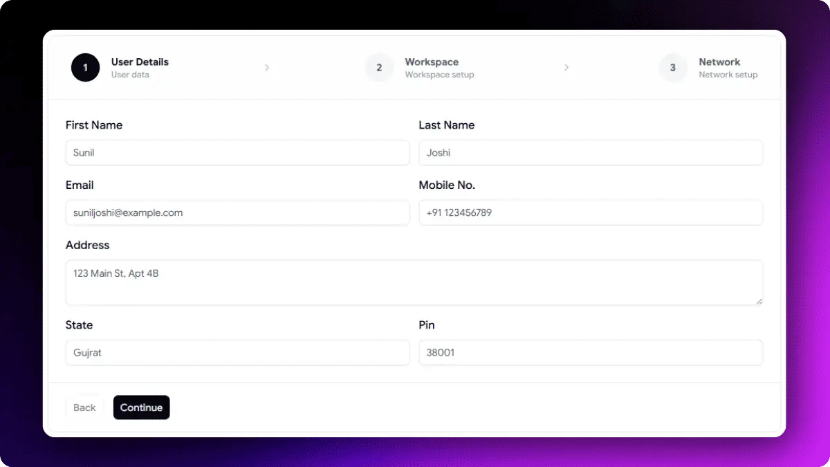
User Profile Form
It helps users update account information in a structured way while keeping different types of data clearly separated.
Accessibility Highlights:
Personal, workspace, and network details grouped into separate sections
Clear labels and validation for each field
Logical keyboard navigation through the form
Consistent input styling for better readability
Easy-to-scan layout that reduces form complexity
Best for: Employee portals, workspace management platforms, and professional networking applications.
Onboarding Form with Progress Bar
Onboarding forms can quickly feel overwhelming when too much information is requested at once. This Shadcn form example uses a multi-step layout with progress indicators, making it easier for users to complete the process one step at a time.
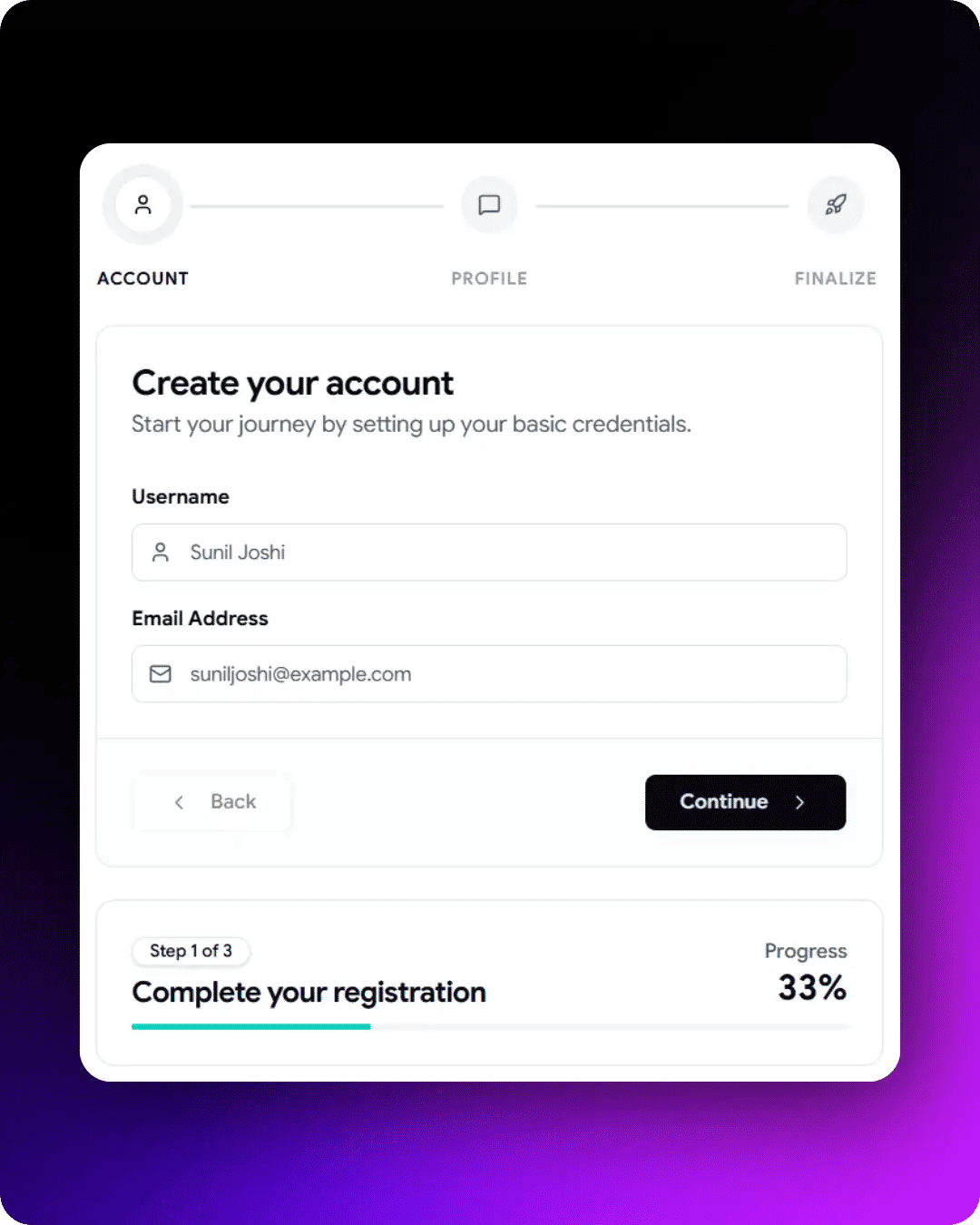
Onboarding Form with Progress Bar
It works well for products that need to collect user information gradually during onboarding and account setup.
Accessibility Highlights:
Progress indicator shows the current step and total steps
Step-by-step navigation makes the process easier to follow
Back and Continue buttons provide predictable navigation
Entered data remains available when moving between steps
Smaller sections help users focus on one task at a time
Best for: SaaS onboarding, customer activation, and account setup workflows.
Build Forms Faster with Shadcn Form Builder
Ready-made Shadcn forms are a great starting point, but not every project fits predefined fields. Sometimes you need a form designed for your workflow or business requirements.

Shadcn Form Builder
Instead of building every field manually, you can use a Shadcn Form Builder to generate forms using simple text prompts. Describe the form you need, such as a job application form, customer onboarding flow, event registration form, or SaaS billing form, and the builder can generate the code for you.
This form builder can help developers:
Create forms faster without starting from scratch
Generate form layouts in minutes
Build forms for specific use cases
Try different form structures quickly
Reduce repetitive setup tasks
Speed up the form development process
For example, you can use prompts like:
Create a customer onboarding form with company details and team information.
Generate a SaaS subscription form with pricing plan selection and billing details.
Build a job application form with skills, experience, and availability fields.
Create a student enrollment form with parent details and subject selection.
Once the form is generated, you can customize the fields, validation rules, styling, and user experience to match your application requirements. This makes an AI-powered form builder a useful option when ready-made Shadcn form templates do not fully match your needs.
Checkout Shadcn Form Builder - https://shadcnspace.com/ai-form-builder
Originally Published here - https://wrappixel.com/blog/shadcn-forms