Accordion or Collapsible? A lot of developers get confused between the two because visually they can look very similar.
But many of the expandable UI patterns we use daily are actually collapsible components, not accordions.
They offer a clean way to hide and show content without making your UI feel crowded.
If you're building with React, Next.js, and shadcn/ui, here are some useful Shadcn components you can use in your projects.
What Is Shadcn Collapsible?
Shadcn Collapsible is a toggle-based UI component that lets users expand or hide content when needed.
The content stays hidden by default and becomes visible only when the user interacts with the trigger.
Features
- Built with React and Tailwind CSS
- Supports controlled and uncontrolled state
- Fully accessible with keyboard and ARIA support
- Easy to customize for different layouts
Why Developers Love Collapsible Over Accordion or Dialog
Collapsible components are useful when you want to reveal extra information without moving users away from the current context.
Compared to accordions and dialogs:
- More flexible than Accordion for standalone expandable content
- Less interruptive than Dialogs for secondary information
- Keeps interfaces cleaner by hiding non-primary content
- Great for dashboards and settings panels
Built a collapsible using shadcn?
Feel free to share it — I’d love to review it and feature it here.
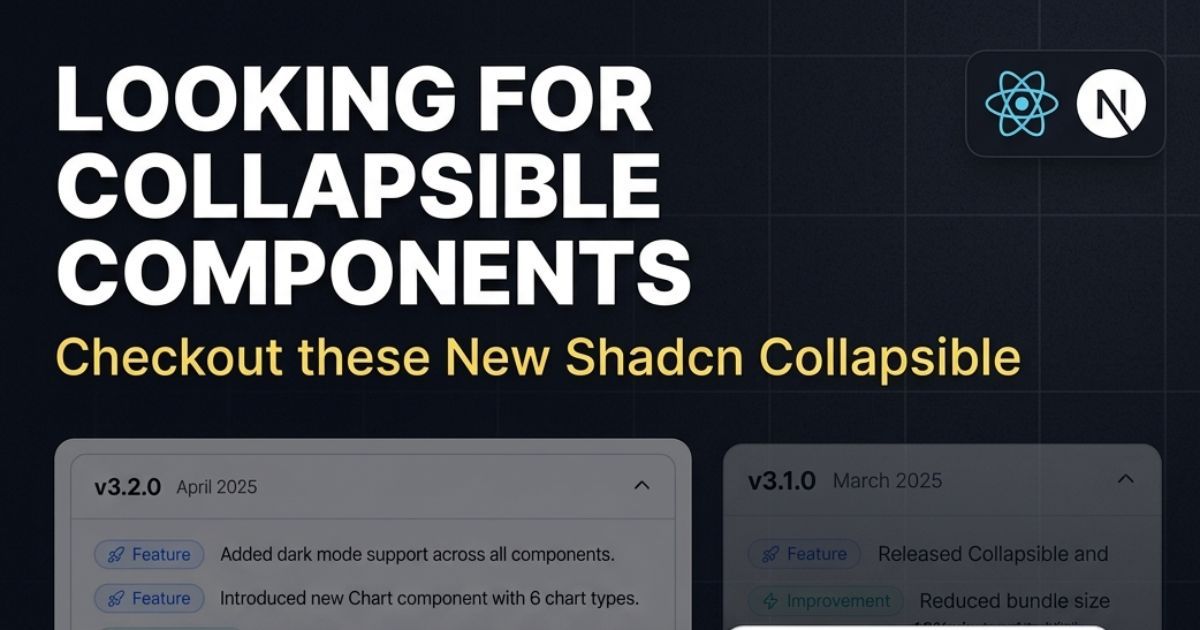
Changelog Collapsible
A collapsible layout designed for changelog or release notes sections.
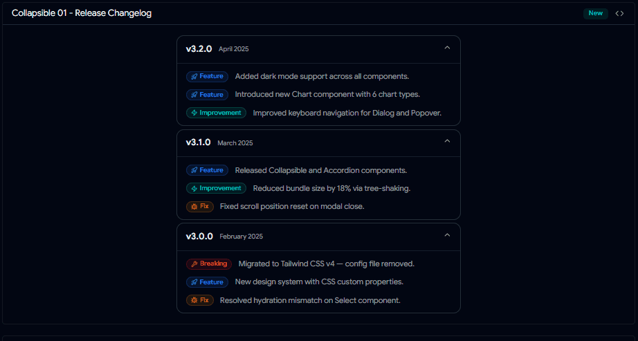
Changelog Collapsible
Useful when you want users to expand version updates only when needed.
Dashboard Sidebar Collapsible
Perfect for nested sidebar menus in dashboards.
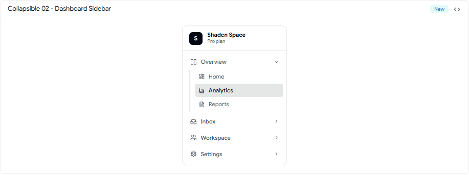
Collapsible 02 - Dashboard Sidebar.gif
Helps keep navigation compact while supporting deeper menu structures.
API Keys Manager Collapsible
A practical collapsible pattern for showing and hiding API keys or secure settings.
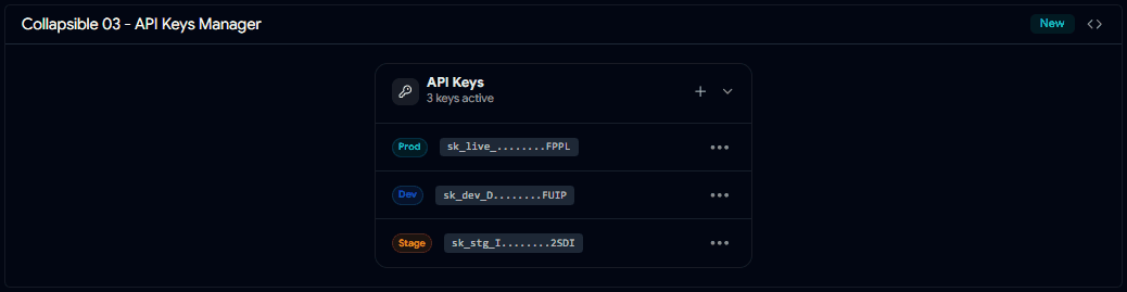
Collapsible 03 - API Keys Manager.gif
Useful in developer dashboards and account settings.
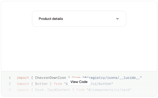
Basic Collapsible
A simple expandable content block for showing and hiding one section of content.
Great for FAQs, notes, and small detail sections.
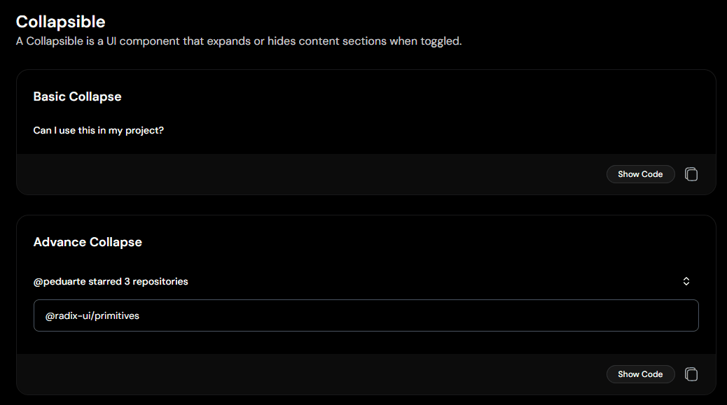
Basic & Advance Collapsible
Advanced Collapse
A more feature-rich collapsible with support for showing multiple nested items under one trigger.
Useful for grouped content layouts.
Dropdown Collapsible
Uses a trigger button to reveal additional options or hidden settings.
Basic Dropdown Collapsible
A clean pattern for compact settings panels.
Settings Panel Collapsible
Designed specifically for settings UIs where advanced options can stay hidden until needed.
Settings Panel Collapsible
Keeps forms and settings screens less overwhelming.
File Tree Collapsible
Uses nested collapsibles to create expandable folder/file structures.
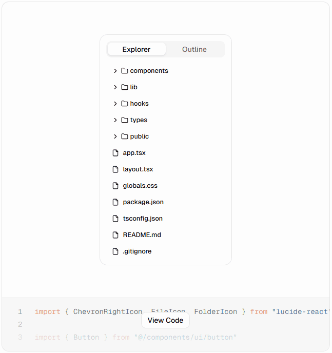
File Tree Collapsible
Perfect for IDE-style interfaces, CMS panels, or docs explorers.
Common Use Cases for Collapsible Components
Collapsible patterns are used in many real-world interfaces.
Popular Use Cases
- FAQ sections with expandable answers
- “Show More” for long descriptions
- Advanced dashboard filters
- Grouped settings panels
- Sidebar menus with nested navigation
- Logs or technical details in cards
Production Tips for Using Shadcn Collapsible
Small UX decisions make collapsibles feel much better in production.
Best Practices
- Use clear trigger labels like Show More or Expand Details
- Avoid hiding critical content by default
- Keep animations smooth but fast
- Add icons for better open/close indication
- Avoid too many nested levels
- Keep expand/collapse behavior consistent across the app
Final Thoughts
Collapsible components are one of the easiest ways to make dense interfaces feel cleaner.
They help you organize secondary content, reduce clutter, and improve scanning without removing information completely.
Pick the variation that matches your use case, customize it, and ship faster.
FAQs
Can I Use Animations with Shadcn Collapsible?
Yes.
You can add smooth expand/collapse animations using Tailwind transitions or animation libraries like Framer Motion.
Is Shadcn Collapsible the Same as Accordion?
Not exactly.
They may look similar, but:
- Collapsible controls one expandable section
- Accordion manages multiple grouped items with structured open/close behavior
When Should I Use Collapsible Instead of Dialog?
Use Collapsible when content belongs in the current page flow.
Use Dialog when you need focused attention or modal interaction.
Looking for More Shadcn Collapsible Components?
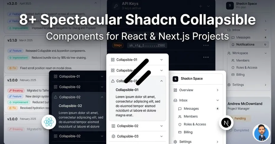
Collapsible OG Img 2.jpg
Check out more modern Shadcn Collapsible components to use in your projects.
Built Your Own Collapsible?
Share it with me on:
I’d love to review it and feature it here.