Working on a React or Next.js project?
Today I’m sharing some of the most useful and clean Shadcn Combobox components you can use in your apps.
Whether you’re building admin panels, forms, dashboards, or SaaS products, a good combobox can improve search and selection experience instantly.
What is a Combobox?
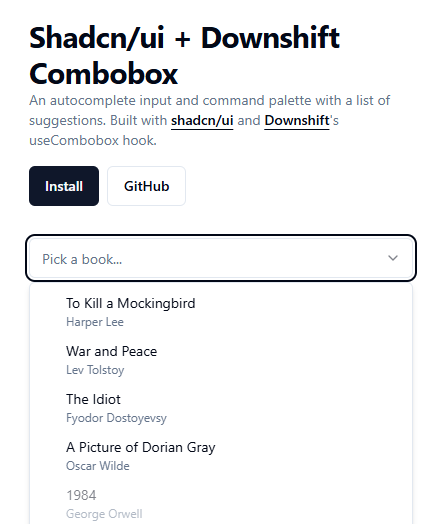
Imagine typing into a search bar and instantly seeing relevant suggestions pop up. That’s exactly what a combobox does. It blends an input field with a dropdown list, allowing users to type and select options effortlessly.
Instead of scrolling through endless lists, users can simply type a few letters—like “New”—and instantly find “New York.” It’s fast, intuitive, and exactly what modern users expect.
Why It Matters in Modern UI
User experience can make or break your app. A clunky dropdown slows users down, while a smart combobox speeds everything up. Especially in dashboards, admin panels, and SaaS tools, efficiency isn’t optional—it’s expected.
Understanding Shadcn UI
What is Shadcn UI?
Shadcn UI is a collection of beautifully designed, accessible, and customizable components built for React and Next.js. It’s not just a component library—it’s more like a toolkit that gives you full control over your UI.
Why Developers Prefer Shadcn Components
Why are developers gravitating toward Shadcn? Simple:
- Clean and modern design
- Fully customizable
- Built with accessibility in mind
- Seamless integration with Tailwind CSS
It gives you the flexibility of building from scratch without actually starting from scratch.
Key Benefits of Using Shadcn Combobox
Improved User Experience
Nobody likes scrolling through 200 options. A combobox turns that frustration into a quick search experience. It’s like switching from flipping pages to using Google.
Better Performance with Large Data
When dealing with large datasets, comboboxes can fetch and filter data dynamically. This keeps your UI fast and responsive.
Accessibility & Keyboard Navigation
Shadcn combobox components follow ARIA standards. That means users can navigate using keyboards, screen readers, and assistive technologies without issues.
Core Features of Shadcn Combobox
Searchable Dropdowns
Users can type and instantly filter results. This is the backbone of any combobox.
Async Data Support
Need to fetch data from a server? No problem. Shadcn combobox supports async loading, making it perfect for APIs.
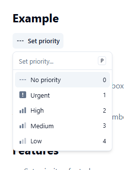
Custom Rendering Options
Want avatars, icons, or flags inside options? You can fully customize how each item looks.
Combobox with Icons
Use Cases
This type of combobox shines when visuals matter. Think tech stacks, categories, or product types.
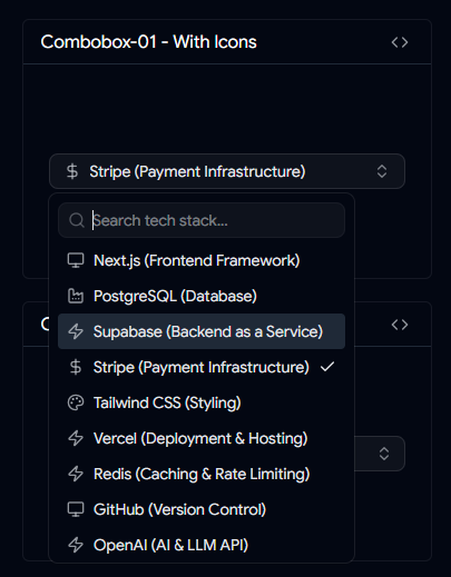
Combobox with Icons
Key Features
- Icons inside dropdown items
- Improved visual scanning
- Better decision-making for users
It’s like adding signboards to a highway—users know exactly where to go.
Combobox with Custom Country Check Icon
Use Cases
Perfect for country selection in forms, onboarding flows, or billing details.
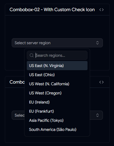
Combobox with Custom Country Check Icon
Key Features
- Custom checkmark styling
- Clear selection feedback
- Clean UI experience
Small visual cues like this make interfaces feel polished.
Combobox with Add Button
When to Use It
Ever wanted users to quickly add new items while selecting? This combobox makes it possible.
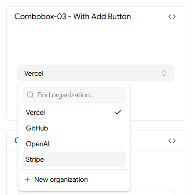
Combobox with Add Button
Key Features
- Built-in add button
- Instant confirmation
- Ideal for dynamic inputs
It’s especially useful in tagging systems or quick-entry forms.
Timezone Combobox
Importance in Global Apps
If your app serves users worldwide, timezone selection is unavoidable. And let’s be honest—timezones can get messy.
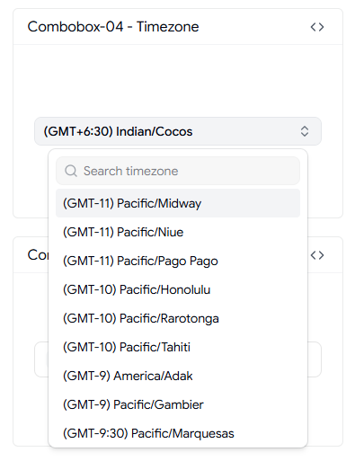
Timezone Combobox
Key Features
- Searchable timezone list
- Multi-region support
- Easy selection
This keeps scheduling features smooth and error-free.
User Selection Combobox
Admin Panel Use Cases
Assigning users to tasks, roles, or projects becomes much easier with this component.
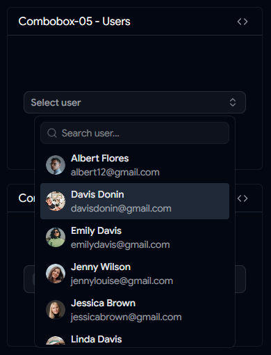
User Selection Combobox
Key Features
- Avatar support
- Name display
- Selection indicators
It adds clarity, especially when dealing with large teams.
Country Combobox with Flags
UX Benefits
Flags provide instant recognition. Users don’t need to read—they just glance and select.
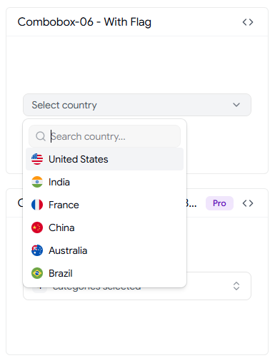
Country Combobox with Flags
Key Features
- Flag icons
- Searchable list
- Clean layout
It’s a small touch that dramatically improves usability.
Virtualized Shadcn Combobox
What is Virtualization?
Rendering thousands of items at once can slow down your app. Virtualization solves this by only rendering what’s visible.
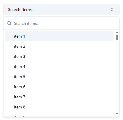
Virtualized Shadcn Combobox
Performance Benefits
- Handles massive datasets
- Smooth scrolling
- Reduced memory usage
If your dataset is huge, this isn’t optional—it’s essential.
Downshift Selection Combobox
Multi-Select Capabilities
Sometimes users need to select multiple options. This combobox supports checkbox-style selection.
Downshift Selection Combobox
When to Use Downshift
Use it for:
- Filters
- Settings panels
- Category selection
It gives users more control without complicating the UI.
Shadcn Linear Combobox
Design Inspiration
Inspired by Linear’s sleek UI, this combobox focuses on minimalism and clarity.
Shadcn Linear Combobox
UX Advantages
- Clean design
- Fast interaction
- Modern feel
It’s proof that simple design can still feel powerful.
Best Practices for Using Shadcn Combobox
Debouncing Search
Adding a 150–300ms delay prevents unnecessary API calls and improves performance.
Handling Empty States
Always show messages like “No results found.” Silence confuses users.
Mobile Optimization
Make touch targets larger and ensure smooth scrolling. Mobile users shouldn’t struggle.
Common Mistakes to Avoid
Overloading Options
Too many options without filtering can overwhelm users. Keep it manageable.
Poor Accessibility Implementation
Ignoring ARIA roles or keyboard navigation can make your app unusable for some users. That’s not just bad UX—it’s exclusionary.
Conclusion
Shadcn combobox components are more than just UI elements—they’re productivity boosters. They simplify complex selections, enhance usability, and make your applications feel fast and modern.
Whether you're building a SaaS platform, admin dashboard, or simple form, choosing the right combobox can dramatically improve the user experience. From icon-based selections to virtualized lists, there’s a solution for every use case.
If you want your React or Next.js app to feel polished and professional, investing in a well-designed combobox is a smart move.
FAQs
1. Can Shadcn Combobox handle large datasets?
Yes, especially when combined with virtualization or server-side search.
2. Is it possible to customize the design?
Absolutely. Shadcn components are highly customizable using Tailwind CSS.
3. Does it support multi-select functionality?
Yes, you can implement multi-select using checkbox-style interactions.
4. Can I use it with APIs?
Yes, Shadcn combobox works well with async data fetching.
5. Is it accessible by default?
Yes, it follows ARIA standards and supports keyboard navigation.
👉 Looking for more Shadcn Combobox Components?
Browse more reusable shadcn combobox for your next project.
shadcn combobox