


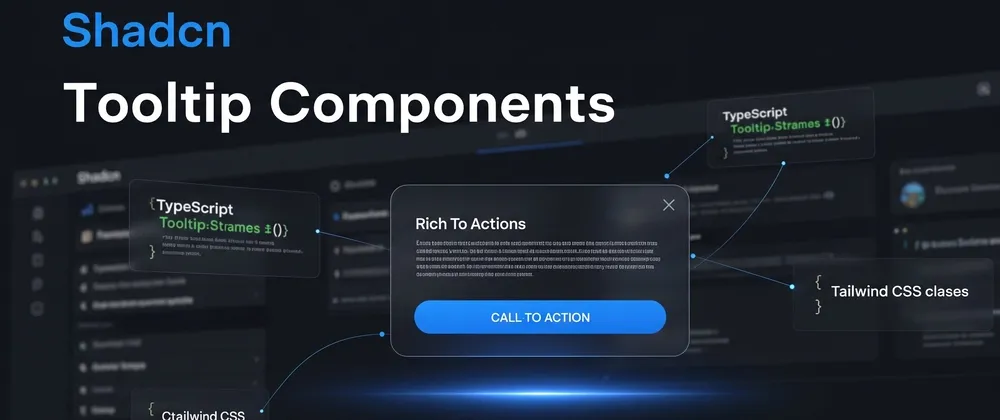
Shadcn tooltip components are a set of 7 UI patterns built with Base UI primitives, React, TypeScript, and Tailwind CSS for delivering contextual hints in web apps. They are free, lightweight, and designed for use in dashboards, forms, lists, and interactive interfaces.
You can install these tooltip components using any of the popular package managers: pnpm, npm, yarn, or bun. These patterns are accessible, composable, and easy to integrate into React or Next.js apps.
This guide covers 7 Shadcn tooltip components. We evaluated these components based on:
Code clarity
Accessibility support
Animation control
Reusability in production apps
Tailwind + Shadcn compatibility
Developer customization scope
All components are built around the Shadcn UI ecosystem and follow a clean component structure.
If you are building SaaS analytics, CMS platforms, admin panels, or content-heavy products, these tooltip patterns help improve interaction clarity without adding layout complexity.
Before we start the list, here is what you get:
7 tooltip variations
4 positioning directions
Animated appearance using Tailwind transitions
3 content-rich card styles
Avatar and error use-case specific variants
What You Get
Total components included: 7
Positioning options covered: 4
Tooltip content types: static text, cards, animated, avatar, error messages
Built with: React + TypeScript + Tailwind CSS + Base UI
Before adding them, wrap your app with <TooltipProvider> in your root layout.
Tooltip Components List
Below are the 7 tooltip variants currently available, each built on the same Base UI foundation with consistent API structure and CLI installation support.
Hover Blog Card
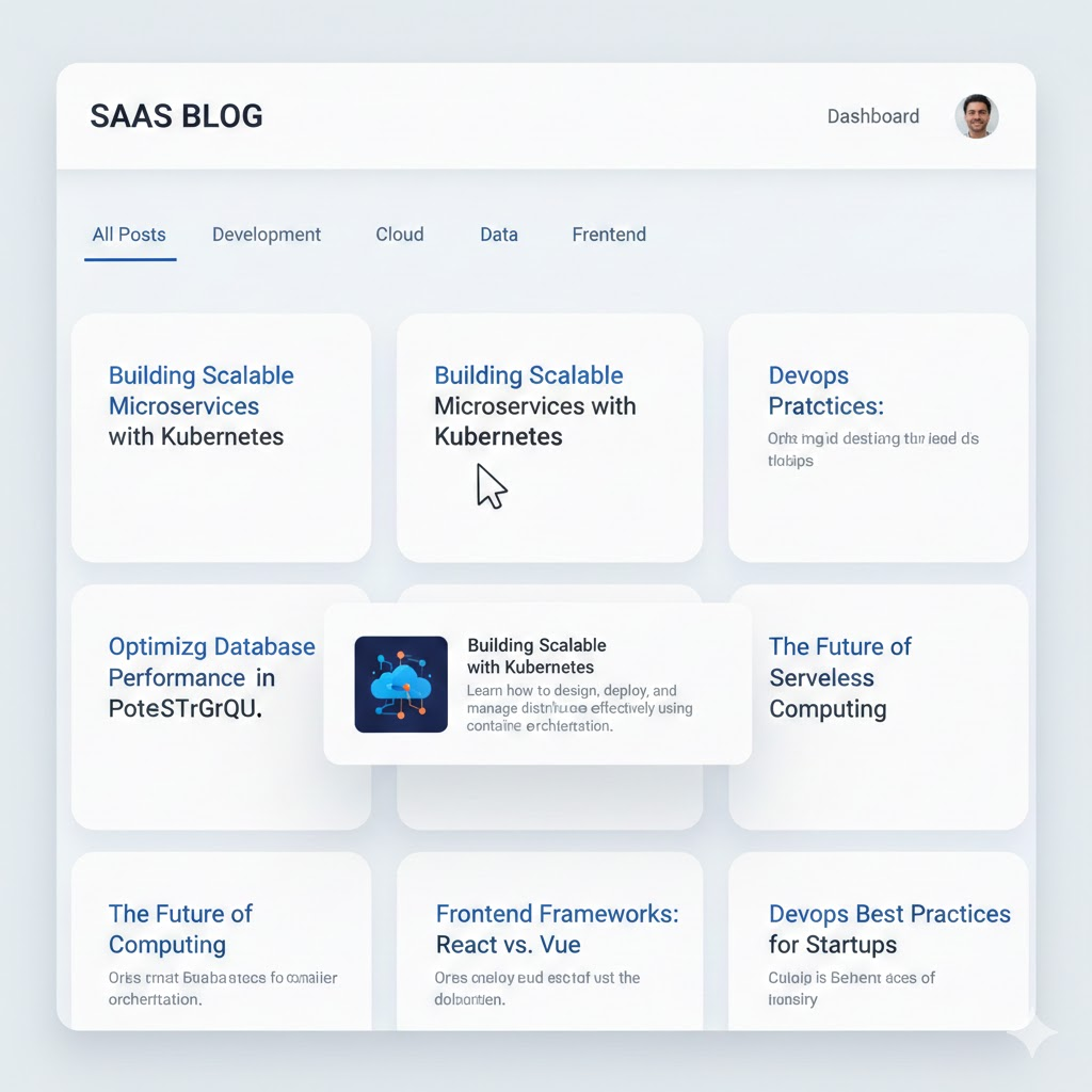
Image description
Best for: Blog previews and content platforms
Use Case
Displays a blog preview card when hovering over a link or title.
Dev-Centric Key Features
Accepts structured blog data
Supports image, title, and summary
Works with dynamic routing
Configurable delay duration
Can render dynamic content
Content Tooltip
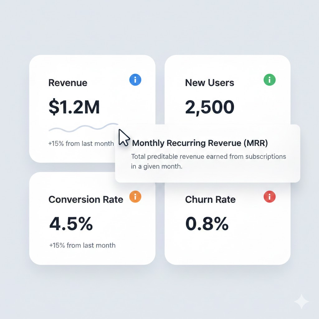
Image description
Best for: Feature explanations in dashboards
Use Case
Shows multi-line formatted content inside a tooltip.
Dev-Centric Key Features
Supports JSX content
Works with icons and text
Hover and focus trigger
Keyboard accessible
Animated Tooltip
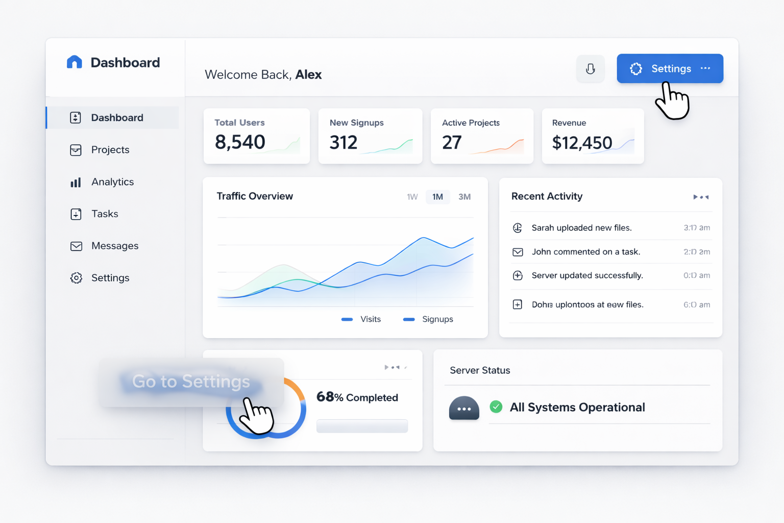
Image description
Best for: Interactive UI patterns
Use Case
Tooltip appears with animated transition.
Dev-Centric Key Features
Tailwind transition utilities
Fade and scale effects
Configurable delay
Controlled open state support
Rounded Tooltip
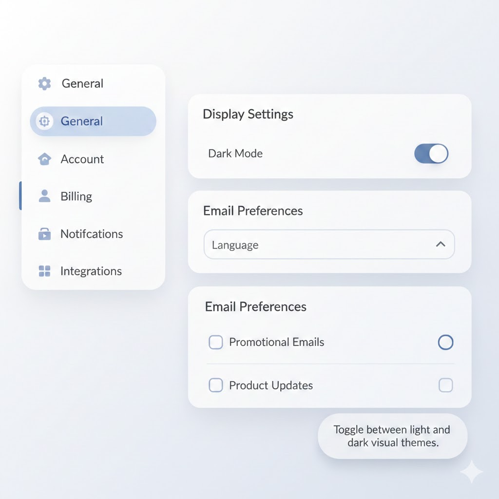
Image description
Best for: Design system consistency
Use Case
Rounded style tooltip variant.
Dev-Centric Key Features
Custom border radius
Padding control
Tailwind utility styling
Theme adaptable
Tooltip Position
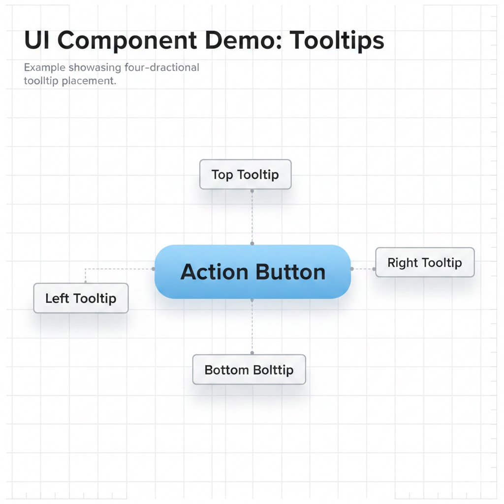
Image description
Best for: Complex layouts and tight UI spaces
Use Case
Demonstrates tooltip placement around elements.
Supported Directions
top
bottom
left
right
Dev-Centric Key Features
Adjustable side offset
Viewport collision handling
Works inside scroll containers
Flexible trigger component
Avatar Tooltip
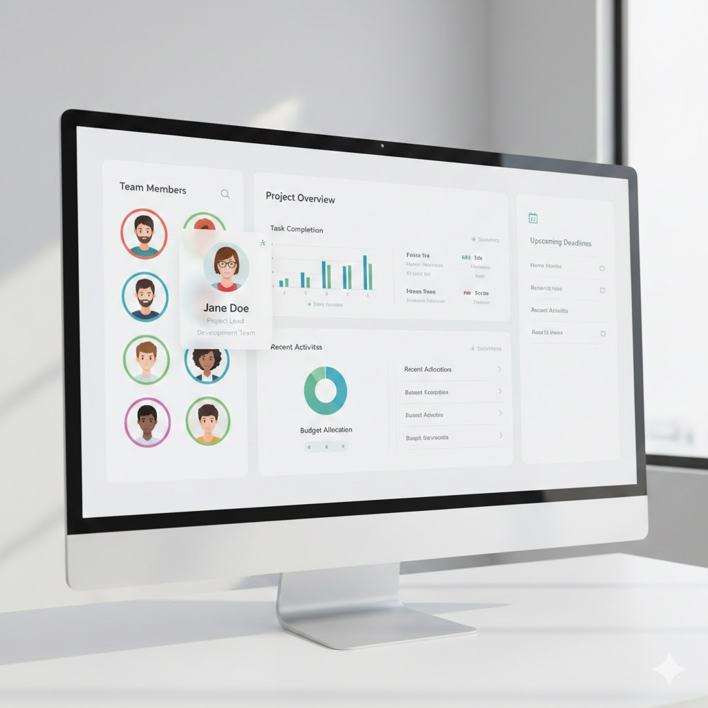
Image description
Best for: Team dashboards and user panels
Use Case
Shows user details when hovering on avatar.
Dev-Centric Key Features
Accepts user metadata
Supports avatar image
Integrates with auth data
Works in lists and grids
Error Tooltip
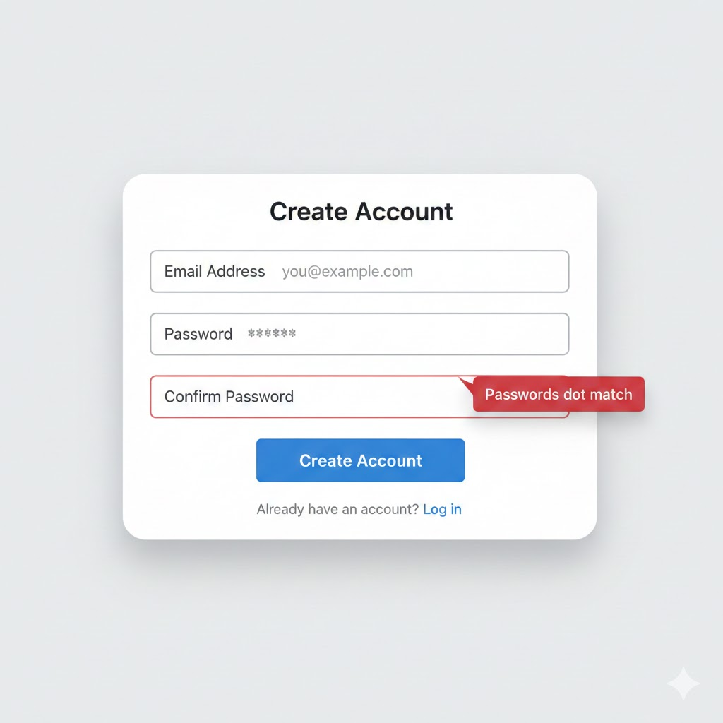
Image description
Best for: Form validation
Use Case
Displays validation error near input field.
Dev-Centric Key Features
Controlled visibility
Inline error styling
Works with validation libraries
Positioned without layout shift
FAQs
1. How do I control tooltip visibility programmatically?
Use controlled mode with open and onOpenChange props from the Tooltip root component.
2. Can I use these tooltip components inside Next.js App Router?
Yes. Add "use client" at the top of your component file because tooltips require client-side interaction.
3. How do I adjust tooltip placement dynamically?
Use the side and sideOffset props to control direction and spacing.
Final Thoughts
These 7 tooltip Shadcn components provide a structured way to handle contextual hints in React and Next.js applications using Base UI primitives and Tailwind CSS. Each variant solves a specific UI need such as blog previews, dashboard explanations, avatar metadata, validation errors, and controlled positioning. All components follow the same CLI installation method and consistent API structure, which reduces setup time and avoids custom tooltip logic.
Since all tooltip variants are free to use and built with TypeScript support, they integrate directly into modern frontend stacks without extra dependencies. If your project already uses Shadcn CLI and Tailwind, these components fit naturally into your workflow and maintain accessibility, composability, and predictable behavior across your application.


